


Artificial Inteligence
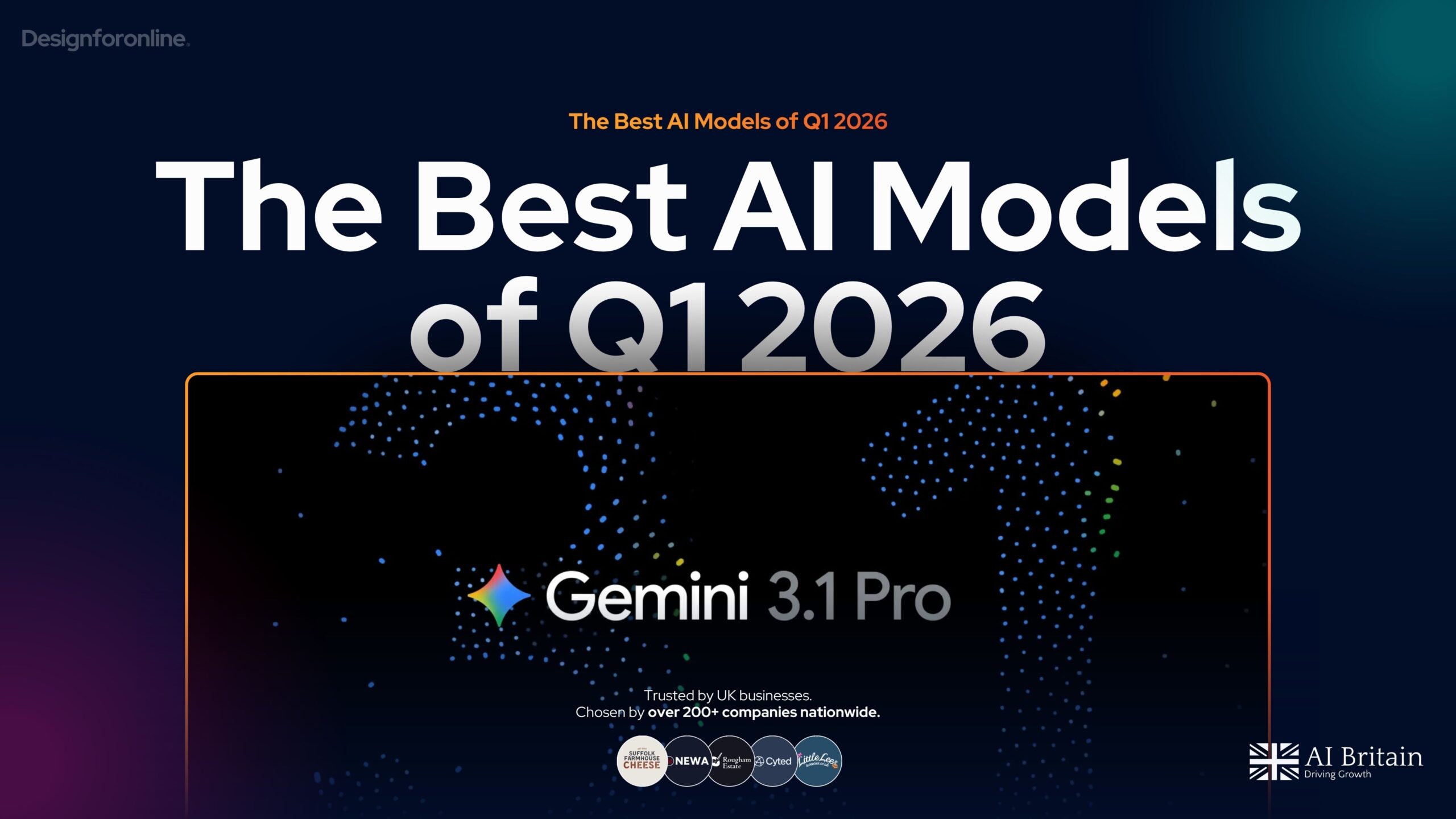
The Best AI Models so far in 2026
Gemini 3.1 Pro, Claude Sonnet 4.6, Grok 4.20 and more dropped in February 2026. We rank the best AI models, benchmarks & break down costs.
Artificial Inteligence
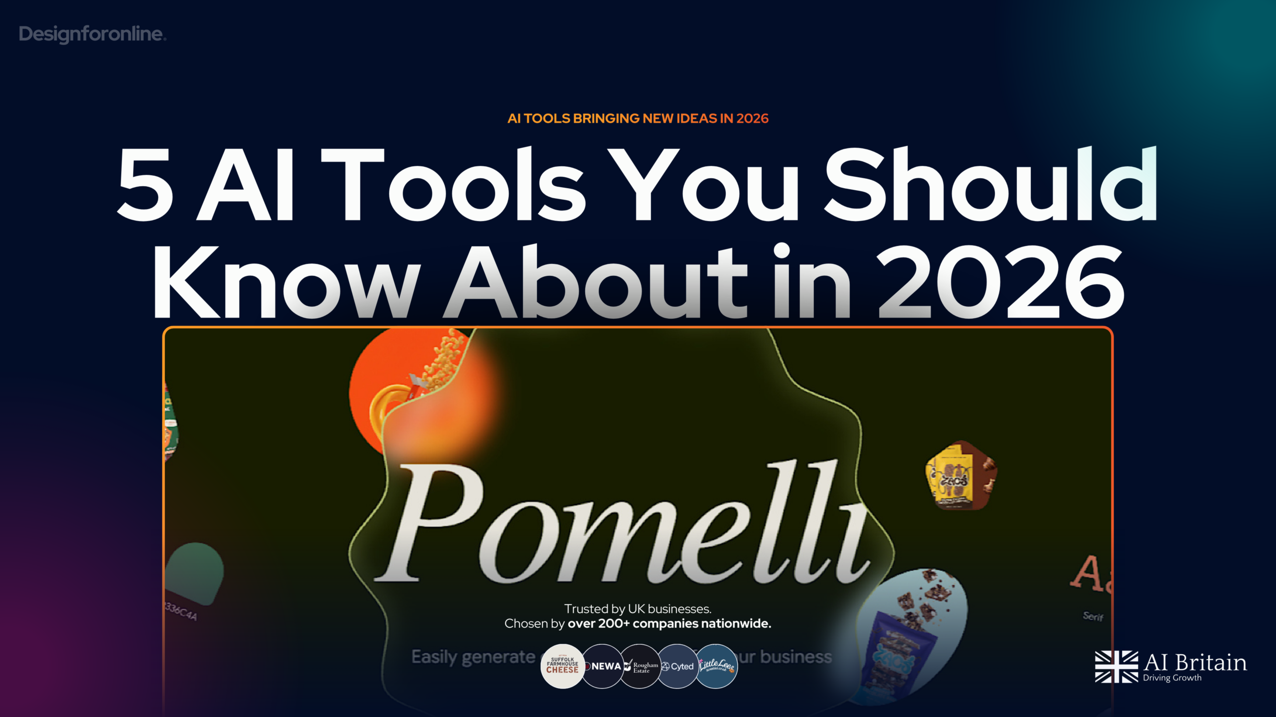
5 AI Tools You Should Know About in 2026
From Google's brand content generator to AI video and task automation, these are the tools making a real impact right now. We break down what ...
Artificial Inteligence
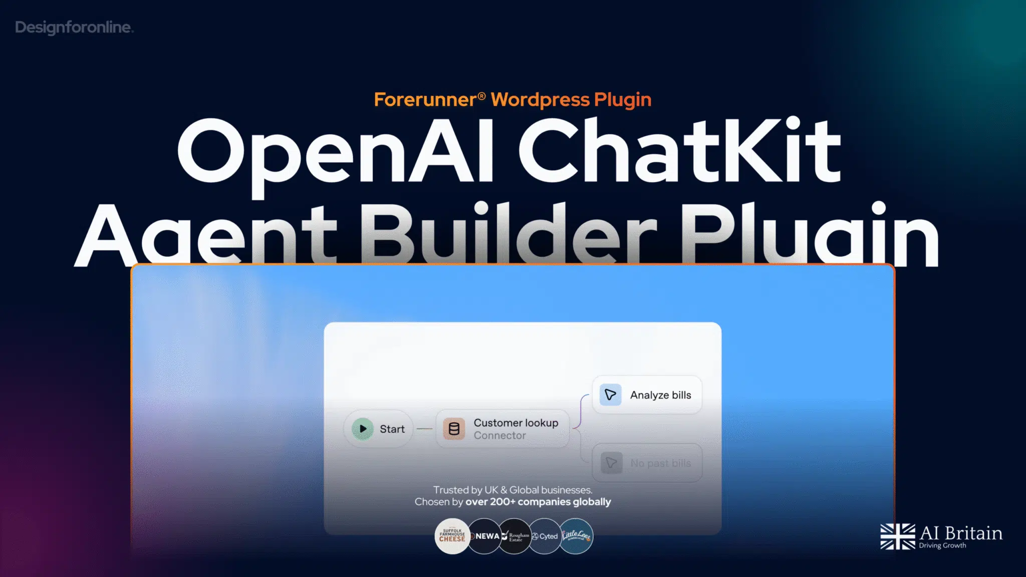
AgentKit arrives. Our Plugin brings OpenAI’s Agent Builder and ChatKit to WordPress
OpenAI has launched AgentKit, a toolkit for building, evaluating and shipping AI agents. Our Plugin enables all ChatKit functionality on Wordpress